Location: GUIs >
Windows >
Chicago Beta-1
<< Previous Page | 1 | 2 | 3 | 4 | 5 | 6 | 7 | Next Page >>
Microsoft Windows "Chicago" beta-1
screen shots
| One day while browsing the net I stumbled across an old MS-Word document
titled "Microsoft Windows Chicago Reviewers guide". It contains screen
shots and lengthy descriptions of Microsoft's Chicago Beta-1 operating
system from around May 1994. It has some very interesting information,
so I decided to convert it to HTML and post it here. It is a very, very
long document with quite a bit of marketing fluff in some sections and
technical detail in other. As a result I decided just to include the sections
and images relevant the Chicago GUI desktop. Sections that I omitted are
denoted by [...].
If you want to see the original document, it can be downloaded here:
Reviewers
Guide to Chicago Beta-1/Early Windows 95 (Word 6 format)
Interesting things:
-
Some screen shots appear to be from earlier versions of chicago than others.
-
We can add another name to the "Inbox","Exchange" (client), "Windows messaging"
confusion - it was originally called "Info Center".
-
Some versions of the start menu had an arrow on them indicating which direction
the menu would open.
-
No icons or product name in main start menu yet.
-
Some controls still do not have 3d appearance.
-
There are different icons in many places.
-
Diamond shaped option buttons.
-
Many dialogs rearranged in the final version.
-
No mention of including any web browser!
|
[...]
The Desktop: Neat, Clean, and Logical
After you boot into Chicago, you are presented with the new Chicago
desktop (see Figure below). Its neat and clean with only a few graphical
objects on the screen. Its like moving into a new office before
you have the chance to really get it messy.
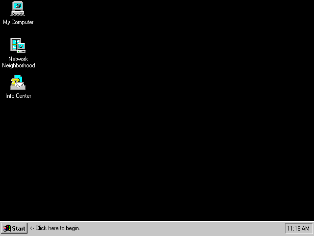
Figure 5. The Chicago Desktop
The simplicity of the desktop appeals to all users sense of cleanliness
but also serves to focus the novice user on the essentials:
-
Taskbar. Quickly start a program from the Start Button.
Easily switch tasks.
-
My Computer: Makes browsing your PC logical and easy.
-
Network Neighborhood. In the world of mapped drives and complex
interfaces, users are unable to browse the network. Chicagos Network
Neighborhood makes browsing networks possible and easy, independent of
the network provider (such as, Windows NT Advanced Server, NetWare, or
Chicago itself).
-
Info Center. Optionally installed. Gives the user a
single place to go to access all MAPI-provided information (such as, Mail,
Microsoft At Worktm faxing).
The Chicago Taskbar: Home Base
More than any other feature, the Taskbar exemplifies the order of magnitude
improvement in ease of use and learnability of the Chicago UI. It
is the anchor of the UI. Its mission is to make 95% of what a typical
user wants to do with the operating system easily accessible at all times.
An indicator of a great design is that it turns out to be much more than
it was originally intended. The Taskbar started out specifically
as a novice user program launcher and task switcher. However, its
simplicity and power have turned out to be favorites of experienced windows
users, and it has many more capabilities.

Figure 6. The Chicago Taskbar
The two key features of the Taskbar are the Start Button and Push-button
task switching.
The Start Button: Up and Running in Seconds
Usability tests on Windows 3.1 show that it takes a brand new Windows
user an average of nine minutes to open "Write". With Chicago, opening
Wordpad takes a new user an average of three minutes. If only the
users that launched Wordpad via the Start Button (rather than by other
means) are counted the average time to launch drops below one minute!
The main reason for this dramatic 3x-9x speed improvement is the Start
Button. Without ever having to know about double clicking, complex
hierarchies, or program manger groups, a beginning Chicago user can quickly
launch a program and get to work.
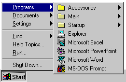
Figure 7. The Chicago Start Button
However, the Start button is much more than a super-efficient program
launcher.
-
Programs. During Setup the user is asked to select his or
her most often used programs. These programs are placed in the Programs
menu of the Start Button. In the future the user can easily change
the programs that appear on this menu by selecting Taskbar Settings right
from the Start Button. For upgrades, all of their Windows 3.1 program
groups are converted to folders within the programs folder and are accessible
from the Start Button.
-
Documents. The Documents menu of the Start button contains
a list of the last 15 documents the user opened. It provides very
quick access to the most recently edited files. This helps prevent
time-consuming and frustrating browsing and helps people begin to think
of their work in terms of documents ("document-centricity"), rather than
applications.
-
Settings. Gives quick access to the Control Panel, the Printers
folder, and the Fonts Folder. It also allows the user to customize
the Taskbar itself (such as, what programs to include in Start Programs
menu) to suit personal working preferences.
-
Find. Find is a new feature of Chicago that goes far beyond
File Managers File Search feature in Windows 3.1. Searches do need
not conform to the *.* searching syntax, and criteria such as last modification
date, size of file, and full text can now be used. More on Find in
"Power" below.
-
Help Topics. Help has been overhauled for usability in Chicago
and is easily accessible from the Start menu. See "Help" topic later
in this section for details.
-
Run. Provides enhanced command-line type functionality from
the Start Button.
-
Shutdown. Allows for easily accessible and safe shutdown,
restart, and logoff.
[...]
Task Switching Made Simple From the Taskbar
Novices need powerful features presented to them in a very simple and
compelling way, otherwise these features will not be used. Research
on active Windows users shows that only 27% of general Windows users frequently
use more than one application at a time and only 20% frequently use ALT+TAB
task switching. These powerful features of Windows 3.1 are simply
not discoverable.
The objective of the Taskbar is to make switching among multiple applications
as simple as changing channels on a television set. Every new window
that is opened automatically gets a button on the Taskbar. To change
tasks, all the user must do is go to the Taskbar and select the desired
channel. No more minimized program icons, no more disappearing windows.
No matter where the user is, he or she can see all of his or her active
tasks simply by looking at the Taskbar, the Windows TV guide.
Task Buttons re-size automatically depending on the number of active
tasks. Should the buttons get too small to be useful the user can
custom configure the Taskbar. In fact, there are a host of Windows
Taskbar configuration options that allow the user to configure it to fit
his or her needs including:
-
Reposition. The Windows Taskbar can be dragged to any perimeter
position on the screen.
-
Re-size. The width of the Windows Taskbar can be widened by
dragging the inside edge.
-
Auto Hide. The Windows Taskbar can be hidden from the screen
and made appear only when the mouse hits the screen edge by selecting Settings,
Taskbar from the Start Button.
Also, noteworthy is the animation when a task is minimized into the Taskbar
or maximized from the Taskbar. It helps new users understand "where"
a program goes when it is minimized.
An Easier Model for File Management and Browsing
File management and browsing in Windows 3.1 was not intuitive.
Fewer than 55% of general Windows users regularly use the File Manager.
For novice users the File Manger is especially confusing and intimidating.
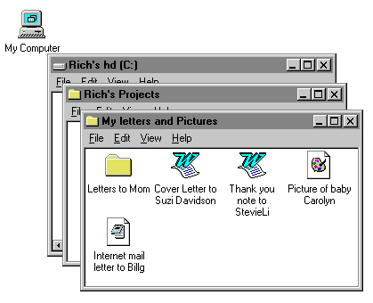
Figure 8. Browsing My Computer
New Windows and Large Icons Work for those new to Windows
Designing a discoverable and comfortable model for browsing and file
management for the novice user has been a priority for the UI design team
because of the observed difficulties with Windows 3.1. Several significantly
different designs have been tested and thrown out. In the course
of this testing the design team made a few basic discoveries about file
management and browsing:
-
Exposed hierarchies are intimidating and unintuitive.
-
Dual-pane views (hierarchy on the left, contents on the right) are also
intimidating and unintuitive. Novices have difficulty understanding
the connection between the logical tree hierarchy on the left and the contents
pane on the right.
-
Object-Oriented UI is great for basic tasks, but not for complex ones.
There exists a general belief that the more object oriented a UI is the
easier it is for the user. This is an appealing theory, but in real
life this is not the case. Direct manipulation of screen objects
and logical resulting behaviors are important for basic functionality (such
as, dragging a file from a folder to the desktop). However, advanced
direct manipulation features such as dragging a file to a printer icon,
are not intuitive. Intuitively, users understand selecting an object
with the mouse then browsing menus or buttons for actions to perform on
that object.
-
Large icon views are much more comfortable than list views.
-
A novices ability to find what he is looking for and feeling comfortable
and "grounded" along the way are the defining characteristics of a good
browsing experience. Efficiency and speed are less important.
The "My Computer" default browsing model is the result of all of this design,
testing, and learning. A folder or drive can be opened by double
clicking or selecting it and choosing File Open. The default browsing
model brings up a new window in large icon view. To many advanced
users this behavior seems cumbersome. Why not open in list view?
Why create a new window, it just clutters up my screen? Why not open
to a dual pane view? Its much more efficient for me. Why not
turn the Toolbar on by default? All of these models and more were
tested thoroughly and discarded (as the default configuration) because
they caused confusion and stress among novices. Novices respond best
when presented only with essential information and when they can easily
"get back" to where they just were.
Note Multiple configuration options are available to experienced
users in View Options.
Chicago has a very powerful dual-pane browsing application for Experienced
users called the Explorer, which is likely how you, as an experienced user,
will prefer to browse. The Explorer will be covered in "Power" below.
Additionally, the File Manager can be run for backwards compatibility.
New Capabilities in the Default Browsing Model
New capabilities of the default browsing model should not be overlooked
in this discussion of simplicity. Folders can be created within folders.
Files and folders respond very logically to being dragged and dropped.
Files and folders can be cut, copied, and pasted just like text and objects
within applications. Views can be customized by the user and each
window "remembers" how the user last configured it, so that the next time
it opens it is in the users favorite view. The best way to discover
the capabilities of the default browsing model is to play with it yourself,
or better yet, find a novice user and watch him use it.
[...]
Name Files in English with Long Filenames
By far, the number one most requested feature since Microsoft has been
in the operating system business is long filenames. The usability
win by eliminating the need to conform to the 8.3 naming convention is
obvious and large. To ensure backwards compatibility with the universe
of existing MS-DOS and Win16 applications, extensions have not been eliminated,
just hidden from view by default.

Figure 9. Chicago long filename
Additionally, files can be renamed in place in Chicago by selecting
the file, clicking on the filename, and typing a new name. The hidden
file extension is not affected by renaming the file. Files can also
be renamed from within the new Chicago common dialogs (including File Open
and Save).
[...]
Network Neighborhood and Networking Accessibility
This section will discuss how the Chicago client makes browsing networks
possible and easy, independent of the network provider (such as, Windows
NT Advanced Server, Netware, or Chicago itself). For more details
about Chicagos networking capabilities, see the section called "Chicago
Networking and Systems Management."
The Network Neighborhood icon, shown in the figure below, sits on the
desktop and logically separates for the user the place to go to browse
resources not on "My Computer". The user can easily browse the network
via the Network Neighborhood just as if he or she were browsing his or
her hard disk.

Figure 10. Network Neighborhood desktop icon
in Chicago
-
The Network Neighborhood is also configured by the administrator
to display, at the top level only those PCs, servers, and printers that
are in the users immediate workgroup. This insulates the user from
the vastness of large corporate networks. However, if the user wants
to browse the larger network, this can be done by opening "Entire Network"
from within the Network Neighborhood. This was not possible prior
to Chicago. When a user browses servers, network connections are
being made without ever having "mapped" a drive.
[...]
-
System-wide support for UNC pathnames makes obsolete the unnecessary
process of "mapping" drives (assigning new drive letters to a specific
network resource). This technology allows the natural network
browsing observed through the Network Neighborhood. UNC pathname
support allows a whole host of usability improvements of which network
browsing is just one.
[...]
-
The "Network" Control Panel tool consolidates all networking configuration
in one location. Solves difficulty of configuring Windows networking
under Windows 3.1 and Windows for Workgroups 3.x.
-
Easy drive mapping is also available in Chicago. There is
a Map Network Drive button on the Explorer and browsing window toolbars.
Also available via right-click on "My computer" for power users.
Mapped drives appear as persistent connections in "My Computer".
-
Networking and mobility are intrinsic to the Chicago UI. The
Chicago UI was designed from the ground up with networking and remote access
in mind. For example, when a file copy detects that the copy is being
performed over a slow-link (modem connection), the copy dialog itself includes
an "estimated time to completion" clock.
-
Networking integration with new common dialogs (including File Open
and File Save). Full exploitation of new common dialogs throughout
the system will not be implemented until Beta-2. However, key to
the great leap in usability of new common dialogs observed in the labs,
is tight integration with networking. From new common dialogs, the
Network Neighborhood can be browsed just like My Computer. Also,
the majority of basic file management tasks can be performed from within
common dialogs.
New Help Engine: Accessible and Useful Online Information
Online help has been completely re-tooled in Chicago. It underwent
extensive usability testing in the labs and the result is a significantly
easier to use and learn help system. Additionally, customizing and
developing Windows help files by ISVs and corporate customers has been
made dramatically easier. A brief description of the major features
of new Chicago Help follows.
-
Simplified interface. Help in Windows 3.1 was difficult to
learn and use. It had three main functions: Contents, Search,
and Glossary. The Contents view was not well organized and presented
and there was some ambiguity about which of the functions to use when.
Chicago behaves much more intuitively and more like a real reference book.
It only has two Tabs: Contents and Index.
-
The "Contents" Tab is organized like a books table of contents.
Top level "chapters" (iconically represented by a book) are displayed and
can be drilled down on for sub topics (iconically represented as a page).
Many chapters also have "Tips and Tricks" subsections. These have
proved popular in lab testing.
-
Help Topics are short. They all fit in one small screen to
keep users from having to scroll through large, complicated help topics
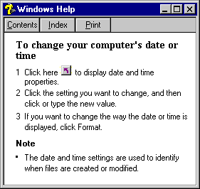
Figure 11. Help Shortcut button
-
Shortcut Buttons make using Help advice simple. New Shortcut
buttons are the most popular feature of Help. Some Help topics contain
these shortcuts that take the user right to the area of Chicago that it
is referencing. For example, a user who is searching for help on
how to change the clock on the PC can "jump" right to the Clock Control
Panel tool, right from within Help. (see figure above).
-
Whats This? From within all Chicago Control Panel tools,
a new "?" icon appears on the upper-right of the Title Bar. By selecting
this the users cursor changes to a "?" and can be dropped on any target
in the dialog box. This brings up a short description of whatever
was selected. "Whats this?" can also be accessed by right-clicking
within Control Panel tools.
More "Document-centric"
OLE 2 introduced document-centricity with in-place editing of objects.
The application window changes and the document stays the same. This
makes the software begin to work the way people work, rather than vice-versa.

Figure 12. New Word document template
The Chicago UI picks up on the concept of document-centricity in several
subtle, but powerful ways including:
-
A window is just an open view of an object. When the user opens a
folder from anywhere in the UI, a new window opens up. The title
of the new window is the same as the name under the folder before the user
opened it. This is logical. In the next generation of applications
written for Chicago, ISVs will follow this same model. A Word for
Chicago document called "My document" is double-clicked from the anywhere
in the UI, and a new window (Word itself) is opened entitled "My Document-Microsoft
Word". This is partially implemented in Beta-1 with Wordpad and Paint.
-
"New" templates from within folders and in the Explorer. From within
any folder in Chicago or from the desktop, new files can be created in
place by selecting File New and then choosing a file type. This is
very convenient for managing files based on projects rather than the whim
of an application.
[...]
Wizards: Your Guide to Powerful Capabilities
Started in Microsofts Applications Group, Wizards are a proven tool
that make it easy for all classes of user to take advantage of powerful
but complex functionality. A series of questions are posed to the
user in a friendly and straight-forward way.
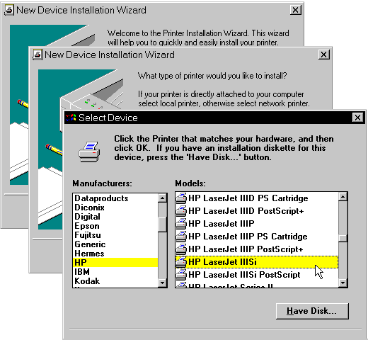
Figure 13. New Device Installation Wizard Walks
User Through Installing a Printer
Chicago uses Wizards throughout the system, including:
-
Add Printer wizard in the Printers Folder
-
New Device wizard in the Control Panel
Remote Access setup wizard in the Network Neighborhood
<< Previous Page | 1 | 2 | 3 | 4 | 5 | 6 | 7 | Next Page >>
|